
Imagine – you serve on the board of a nonprofit organization, and as part of a planning process, you would like to have discussions about
- Who else is out there – people and organizations working in similar or adjacent areas
- Your organization’s identity and mission as distinct from others
- Where you might send programs to that you can no longer sustain at the same level, to make room for new activities or investments
- Allies and potential new partners for high priority programs and activities
- Ways to help board and staff leaders be more strategic and focused with their time spent in collaboration efforts
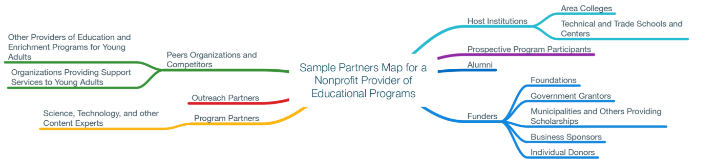
A web of relationships is hard to think about all at once, and to describe in words alone to a group that needs a common base of information to make good decisions. A visual map makes such a web much easier to organize and convey.
This sample shows how you might start building the branches, working from categories of stakeholders, and likely finishing with specific named partners.
I’ve found that a good partners map often elicits “aha” insights from group members, in comments like these:
- “There’s a whole untapped stakeholder group we should be involving in our outreach or fundraising!”
- “No wonder we’re not getting to some critical tasks – we are spread way too thin with collaborations that aren’t essential to our mission.”
To create a partners map I use a mind map application (my favorite is MindNode for Mac) that makes it easy to create a diagram around a central idea, in this case an organization. I’ve also used versions of this for businesses examining their partnering relationships or their competition, and for health care and other types of organizations.
A picture is worth…